Precision-Recall (PR) Curve#
Guides: Precision and Recall
Read the precision and the recall guides if you're not familiar with those metrics.
A precision-recall (PR) curve is a plot that gauges machine learning model performance by using precision and recall, which are performance metrics that evaluate the quality of a classification model. The curve is built with precision on the y-axis and recall on the x-axis computed across many thresholds, showing a trade-off of how precision and recall values change when a classification threshold changes.
-
API Reference:
CurvePlot↗
Implementation Details#
The curve’s points (precisions and recalls) are calculated with a varying threshold, and made into points (precision values on the y-axis and recall values on the x-axis). Precision and recall are threshold-dependent metrics where a threshold value must be defined to compute them, and by computing and plotting these two metrics across many thresholds we can check how these metrics change depending on the threshold.
Thresholds Selection
Threshold ranges are very customizable. Typically, a uniformly spaced range of values from 0 to 1 can model a PR curve, where users pick the number of thresholds to include. Another common approach to picking thresholds is collecting and sorting the unique confidences of every prediction.
Example: Binary Classification#
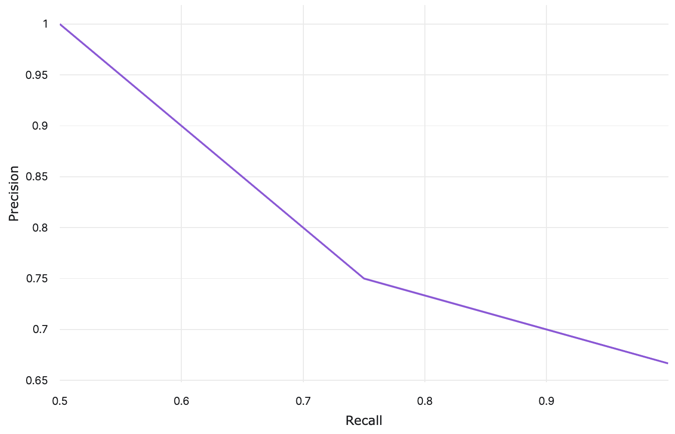
Let's consider a simple binary classification example and plot a PR curve at a uniformly spaced range of thresholds. The table below shows six samples (four positive and two negative) sorted by their confidence score. Each inference is evaluated at each threshold: 0.25, 0.5, and 0.75. It's a negative prediction if its confidence score is below the evaluating threshold; otherwise, it's positive.
| Sample | Inference @ 0.25 | Inference @ 0.5 | Inference @ 0.75 | |
|---|---|---|---|---|
| Positive | 0.9 | Positive | Positive | Positive |
| Positive | 0.8 | Positive | Positive | Positive |
| Positive | 0.7 | Positive | Positive | Negative |
| Negative | 0.4 | Positive | Positive | Negative |
| Positive | 0.35 | Positive | Negative | Negative |
| Negative | 0.3 | Positive | Negative | Negative |
As the threshold increases, there are fewer false positives and more false negatives, most likely yielding high precision and low recall. Conversely, decreasing the threshold may improve recall at the cost of precision. Let's compute the precision and recall values at each threhold.
| Threshold | TP | FP | FN | Precision | Recall |
|---|---|---|---|---|---|
| 0.25 | 4 | 2 | 0 | \(\frac{4}{6}\) | \(\frac{4}{4}\) |
| 0.5 | 3 | 1 | 1 | \(\frac{3}{4}\) | \(\frac{3}{4}\) |
| 0.75 | 2 | 0 | 2 | \(\frac{2}{2}\) | \(\frac{2}{4}\) |
Using these precision and recall values, a PR curve can be plotted:
Example: Multiclass Classification#
For multiple classes, it is common practice to plot a curve per class by treating each class as a binary
classification problem. This technique is known as one-vs-rest (OvR). With this
strategy, we can have n PR curves for n unique classes.
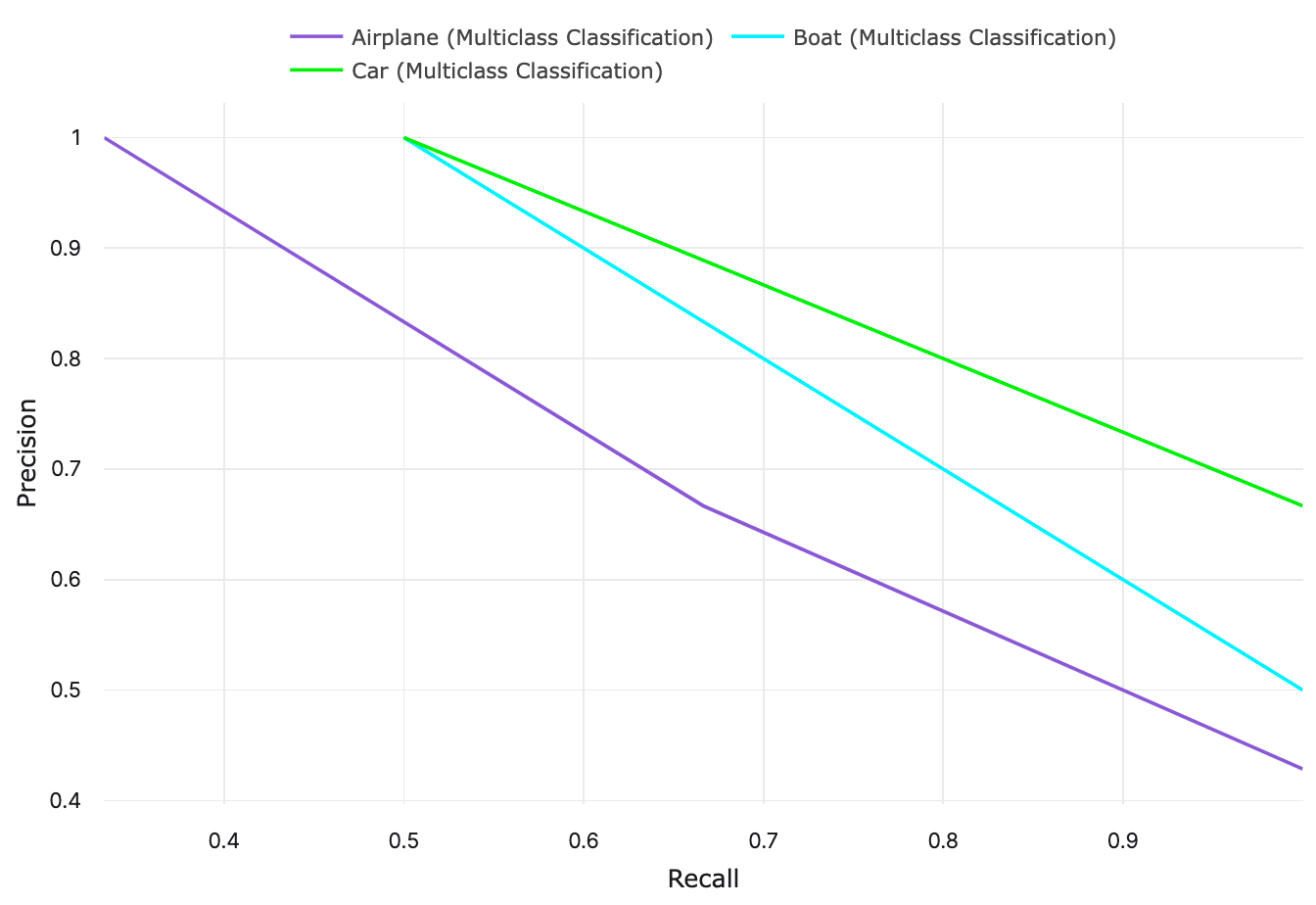
Let's take a look at a multiclass classification example and plot per class PR curves for
the same three thresholds that we used in the example above: 0.25, 0.5, and 0.75. In this example, we have three classes:
Airplane, Boat, and Car. The multiclass classifier outputs a confidence score for each class:
| Label | Airplane Confidence |
Boat Confidence |
Car Confidence |
|---|---|---|---|
Airplane |
0.9 | 0.05 | 0.05 |
Airplane |
0.7 | 0.1 | 0.2 |
Airplane |
0.4 | 0.25 | 0.35 |
Boat |
0.6 | 0.25 | 0.15 |
Boat |
0.4 | 0.5 | 0.1 |
Car |
0.25 | 0.25 | 0.5 |
Car |
0.3 | 0.4 | 0.3 |
Just like the binary classification example, we are going to determine whether each inference is positive or negative
depending on the evaluating threshold, so for class Airplane:
| Sample | Airplane Confidence |
Inference @ 0.25 | Inference @ 0.5 | Inference @ 0.75 |
|---|---|---|---|---|
| Positive | 0.9 | Positive | Positive | Positive |
| Positive | 0.7 | Positive | Positive | Negative |
| Positive | 0.4 | Positive | Negative | Negative |
| Negative | 0.6 | Positive | Positive | Negative |
| Negative | 0.4 | Positive | Negative | Negative |
| Negative | 0.25 | Positive | Negative | Negative |
| Negative | 0.3 | Positive | Negative | Negative |
And the precision and recall values for class Airplane can be computed:
| Threshold | TP | FP | FN | Airplane Precision |
Airplane Recall |
|---|---|---|---|---|---|
| 0.25 | 3 | 4 | 0 | \(\frac{3}{7}\) | \(\frac{3}{3}\) |
| 0.5 | 2 | 1 | 1 | \(\frac{2}{3}\) | \(\frac{2}{3}\) |
| 0.75 | 1 | 0 | 2 | \(\frac{1}{1}\) | \(\frac{1}{3}\) |
We are going to repeat this step to compute precision and recall for class Boat and Car.
| Threshold | Airplane Precision |
Airplane Recall |
Boat Precision |
Boat Recall |
Car Precision |
Car Recall |
|---|---|---|---|---|---|---|
| 0.25 | \(\frac{3}{7}\) | \(\frac{3}{3}\) | \(\frac{2}{4}\) | \(\frac{2}{2}\) | \(\frac{2}{3}\) | \(\frac{2}{2}\) |
| 0.5 | \(\frac{2}{3}\) | \(\frac{2}{3}\) | \(\frac{1}{1}\) | \(\frac{1}{2}\) | \(\frac{1}{1}\) | \(\frac{1}{2}\) |
| 0.75 | \(\frac{1}{1}\) | \(\frac{1}{3}\) | \(\frac{0}{0}\) | \(\frac{0}{2}\) | \(\frac{0}{0}\) | \(\frac{0}{2}\) |
Using these precision and recall values, per class PR curves can be plotted:

Area Under the PR Curve (AUPRC)#
The area under the PR curve (AUPRC), also known as AUC-PR or PR-AUC, is a threshold-independent metric that summarizes the performance of a model depicted by a PR curve. The greater the area, the better a model performs. The average precision is one particular method for calculating the AUPRC. With PR curves, we can visually conclude which curves indicate that a certain class or model has a better performance.
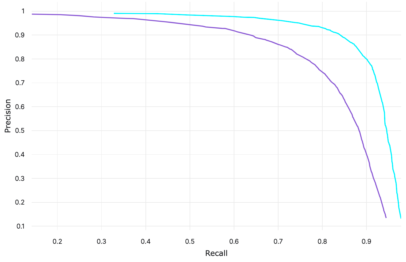
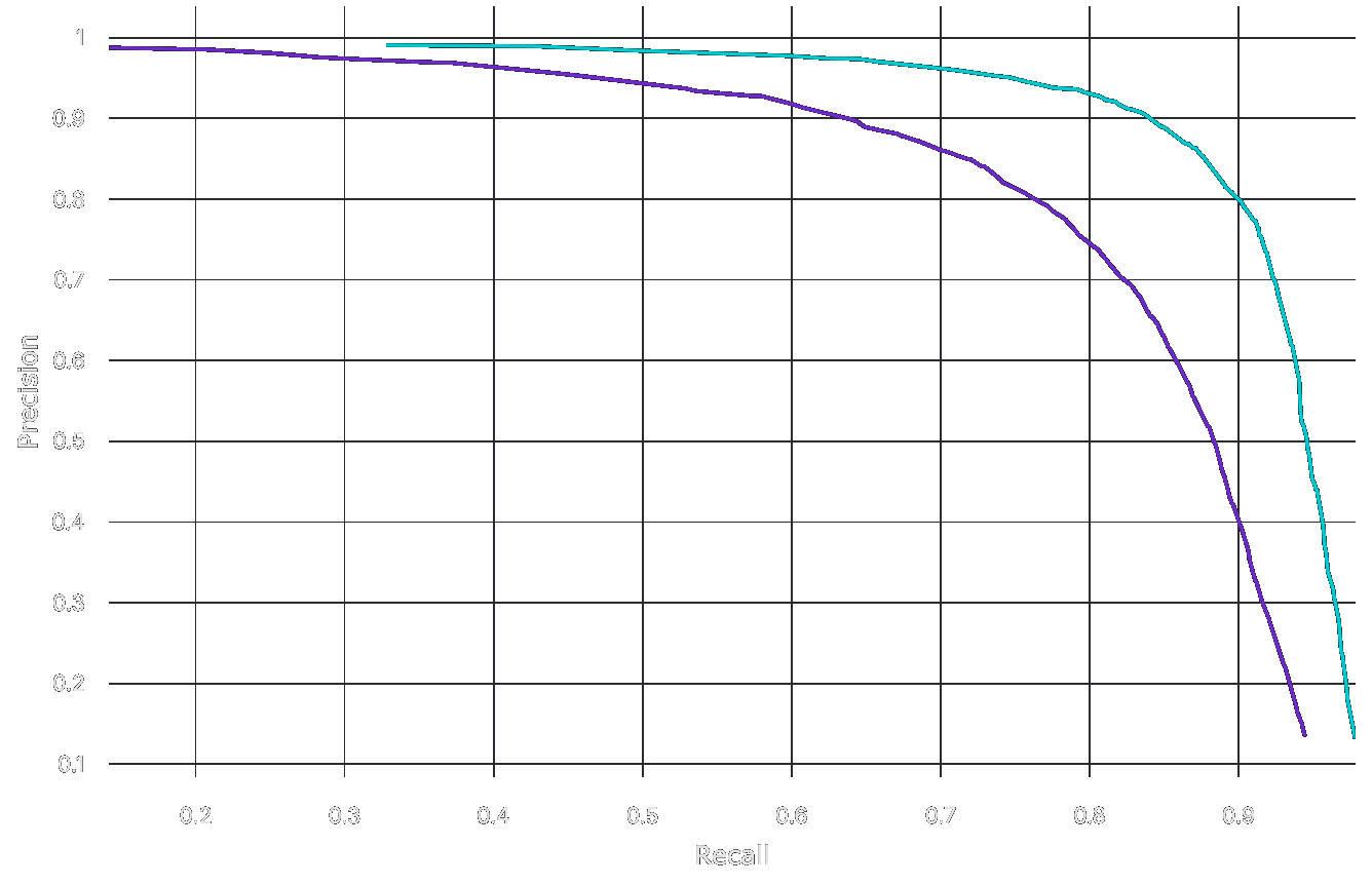
In the plot above, we see that the cyan curve has a higher precision than the purple curve for almost every recall value. This means that the model behind the cyan curve performs better.
Limitations and Biases#
PR curves are a very common plot used in practice to evaluate model performance in terms of precision and recall. There are some pitfalls that might be overlooked: class imbalance, source of error, and poor threshold choices.
- Classes with too few data points may have PR curves that are poor representations of actual performance or overall performance. The performance of minority classes may be less accurate compared to a majority class.
- PR curves only gauge precision and recall based on classifications, they do not surface misclassification patterns or reasons for different types of errors.
- The values of the thresholds affect the shape of PR curves, which can affect how they are interpreted. Having a different number of thresholds, or having different threshold values, make PR curve comparisons difficult.